|
|
|||||||||||||
|
Columns by Nancy K. Austin: Everyone's a Critic... Even You
List all of Nancy's columns
Visit our other Getting Work Columnist
|
When I was in the fourth grade, I nearly drove my poor mother around the bend when I started sending away for every brochure that Sunset magazine promoted in its special travel section each month. For two years I stockpiled those wonderful glossy advertisements for Egypt, the Grand Canyon, and the Great Barrier Reef -- until one summer day when the movers came and packed us up and we headed down to California. I left my prized collection behind, but my passion for the humble brochure endures. I still love everything about them: their compact stylishness, all bright and promising, with a mind-blowing array of shapes and patterns and images and messages -- even the way these clever little publications smell, a scent as alluring in my mind as elementary school handouts, fresh and fragrant from the ditto machine in the principal's office. I submit that a brochure is the most elegant, versatile piece of persuasion there is. If you're an IP with something to sell and little money for big-time advertising campaigns, a brochure is your dream marketing tool -- even if you already have a Web site, loads of business contacts, lively word of mouth, and a big fat ad in the Yellow Pages. For reasons I'm about to make clear, an intelligent, skillfully designed brochure is one of the very best ways to present and explain your product to all those prospective buyers out there. No matter what it looks like or what it's promoting, a good brochure should always accomplish two things: it gets read and it gets results. Assuming you haven't been swept away by some pricey woo-woo design, a brochure generally costs much less to produce than a 30-second commercial or half-page ad. Plus, it has more heft, literally and psychically, than a flimsy throwaway leaflet, so people tend to hang onto a brochure, a huge point in its favor when you consider that it might be the only sales tool a prospect uses to make a purchase decision; that's when a good brochure turns mild curiosity into real sales potential. A brochure can say what you're too humble (or too shy) to say yourself, and say it consistently: it never has an off day, it never chokes. It's durable, more like a useful piece of furniture instead of something you glance at once and then forget. A brochure lingers long after advertising usually does. I see I've neglected to mention that a brochure, adaptable as it is, can't do the whole job of marketing. It's not some miracle substitute for knowing your market, networking, or the face-to-face sales call. And despite what some experts say, don't confuse a brochure with a topnotch salesperson making a perfect pitch on his very best day. A brochure is always going to be a supporting player, never the star (that would be you). It represents you in absentia. You can't sit down and have a sparkly conversation with a brochure. You can, however, use it to put forth an image, showcase a skill, or tell your side of the story. A brochure is not enough by itself to wow the customer and clinch the sale. That, junior birdmen, is still your job. So where do you start, and how do you know if you're on the right track? The first question is easy to answer; the second, less so. Like every big project, a good brochure begins with a plan. Then (and only then) does it move into writing, designing, and printing. Whether you intend to produce it entirely on your own from your trusty desktop or you decide to recruit a pro to help you with the heavy lifting, the first thing you have to figure out is what you expect your brochure to do for you and your business. Capture this in one or two sentences (it's a headache, but aim to do it in one line). Next, describe your audience: who's your target market? Who's going to get your brochure? Who are you leaving out, and why? The better you know who's on the receiving end, the better your brochure will turn out and the stronger your response rate will be. Don't even think about messing around with cool designs, fingering
paper stock, and ogling inks until you know what you want your brochure
to say, and to whom. I know, I know -- this ain't for sissies, since
pound for pound, brochures feature more eye-candy than you can shake
a stick at. It's practically impossible to resist going straight for
the design goodies while you breeze right by the point of the exercise,
which is to build your business by introducing people to who you are,
what your business does, and how it benefits your customers. Here's
a way to get started -- a helpful technique that's as old as the hills,
a staple of IBM's legendary sales-training school. On a regular sheet
of lined paper, make two columns. Label one "features" and the other
"benefits." Now list all the specific features or characteristics of
your product or service alongside the corresponding benefit it delivers
to your customers. For example, an independent caterer's features/benefits
combo might look like this:
Or how about an attorney's list:
Or mine:
Never forget that this is where your brochure is born, not in the eye-popping aisles of your favorite art supply hangout, and not with an out-there logo design. Think substance first, style second. "Don't get gimmicky and don't try to be 'edgy' -- whatever that is," advises Ken Silvia, an independent designer on Cape Cod. "It's like, 'That's a cool name, em2, but your name's Seth, so what's that about?' Tell me what the hell your business is," he pleads. "Keep it simple." When it comes to brochure strategy, less truly is more: you want to get your core proposition across, from the customer's point of view -- here's what I do and why you should care about it. If you suffer from logorrhea, curb your tendency to drone on by forcing yourself to stick to your features/benefits list. Remember that prospects want to learn what you can do for them, not your personal views on saving the salmon of the Pacific Northwest or why Manolo Blahnik's shoes are the essence of glamour. Which is not to say your identity -- your brand -- is insignificant. Always obey this rule: your brochure should positively reek of you. If you promise something you can't deliver, call attention to a degree you didn't earn, or claim you once saved a certain client's bacon when you didn't, you're in deep trouble. "Don't try to be someone you can never be," Silvia says. "Some people aren't suited for suits, and it's the same with a promotion piece. It should reflect who you are, not someone else." Take my first brochure. Designed to promote my speaking and consulting work right after A Passion for Excellence hit number one on national best-seller lists, it was actually a glossy letter-size page that revolved around the single word to which I would become permanently glued: excellence. We (I teamed up with a designer the first time around) decided on extra-wide margins and a simple, easy-on-the-eyes sans serif typeface, because I hate curly-wurly stuff. My one-pager consisted of a color head shot, a short bio, three succinct paragraphs explaining what I covered in my presentations, and contact information. My page slipped neatly into a simple folder (designed at the same time) that could comfortably hold a cover letter, a couple of my articles, a client list, and blurbs from happy customers, all of which was enough to tell who I was, what I did, and where I'd been -- answers to the three key questions I knew prospective customers would ask first. (Oh, and it was no accident that the whole megillah slid perfectly into a FedEx overnight envelope or FedEx Pak, along with my promo video). While you're wrestling with existential questions of identity and purpose, make it your habit every now and then to pick up and closely examine every brochure you can get your hands on. What speaks to you? Does a certain design or paper choice turn you off? Does something light your fire? Which brochure does the best job of persuading you to buy what it's selling, and why? One terrific resource to check out is Terri Alekzander's Fresh Ideas in Brochure Design, a yummy, full-color, oversize book studded with all sorts of striking variations on this theme, from low-budget brochures to annual reports to nifty examples of packaging and presentation. Let some of those ideas reverberate in your head as you work on the meat of your own brochure. Coming in the second installment: producing a great brochure from your desktop. In part three, you'll learn how to work with a designer to create a brochure you love. |
|||||||||||||||||||||||||
|
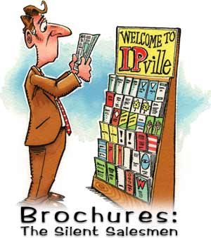
We'd love to hear your feedback about this column, or put you in touch with Nancy K. Austin if you like. You may also like to see her biography. Illustration by Bill Ross. |

The 1099 name and logo are trademarks of 1099 Magazine.